PROGRAMMES DASHBOARD
A ‘HOW TO’ GUIDE
Our interactive programmes dashboard has been developed in partnership with Qlik.org, the corporate responsibility of leading data analytics company Qlik and long-term WeSeeHope partner, to show the scale and reach of our work across Sub-Saharan Africa.
The dashboard pulls and analyses information from an internal database that is populated with:
- Live data: This comes from annual programme proposal data, in addition to “start-up” forms submitted every time a savings and loans group from our Village Investors Programme (VIP) is established. As proposals with different partners are finalised throughout the year and new VIP groups are established on an ongoing basis, this data is regularly being updated.
- Historical data: This comes from annual report data (or proposal data if report data was not available) from every programme we have run since we were established in 2000 up to the present day.
- Financial data: This comes from programme budgets which have been cross-checked with our audited annual accounts to verify how much was given to each partner (current and past).
We recommend viewing the dashboard on a laptop or desktop as functionality and appearance may be slightly limited or distorted on mobile.
HOW TO USE THE DASHBOARD PAGES
The dashboard has five pages that are split into “Current” and “Historical” sections. To navigate between them, use the buttons at the top right hand side of the dashboard, as shown below.

1. Current Programmes: An overview of our current seven programmes.
2. Current Reach: A breakdown per programme of the number of children, parents and guardians, and community volunteers we are currently working with.
3. Historical Partners & Communities Map: An interactive map showing the scope of our work across Sub-Saharan Africa since we were established in 2000.
4. Programmes History: An overview of the programmes, current and past, we have run since 2000. A wide range of programmes comprise those which we no longer run (in grey) so these have therefore been grouped together into seven categories:
- Education
- Scholarship
- Microfinance
- Economic Empowerment
- Psychosocial Support
- Orphanages
- HIV/AIDS Awareness
5. Reach History: A breakdown per programme of the number of children, parents and guardians, and community volunteers who we have worked with since we were established.
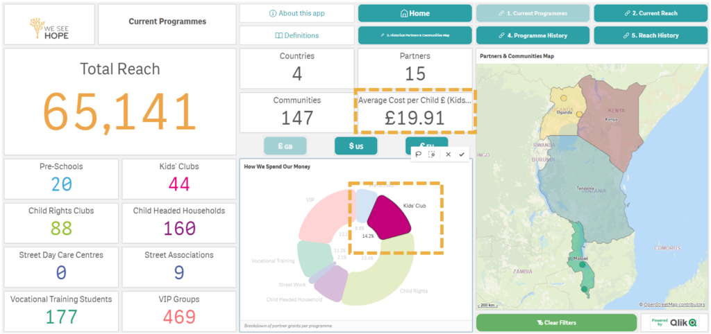
HOW TO USE THE CHARTS
The How We Spend Our Money pie chart on the Current Programmes page functions as an interactive filter which you can use to drill down into the dashboard data. Each segment shows where we are running the programme/s as well as the “Cost per Child” per programme. Below is an example using the Kids’ Club Programme.
HOW TO USE THE MAPS
Each of the maps also act as an interactive filter in two key ways:
- By country: Click outside the small dots and all data will be filtered per country (see below left)
- By partner: Click on the small coloured dots and all data will be filtered by the partner with whom we are running, or have run, the programmes (see below right). In areas where we are working with a number of partners, you will need to zoom in on the map to differentiate between them.
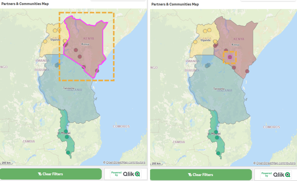
If you hover over the dots, you will see the name of the partner and location, in addition to either the number of communities or people reached depending on which map you are on.
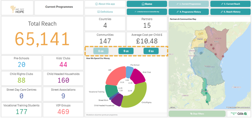
HOW TO CHANGE CURRENCY
On the Current Programmes page, you can change between GBP, USD and EUR currencies using the buttons below to change the “Cost per Child” figures.
HOW TO REMOVE FILTERS
To remove any filters, click the green ‘Clear Filters’ button on the bottom right hand side or the red “X” button.
HOW TO KNOW WHAT EVERYTHING MEANS
Alongside the Programmes dashboard and this ‘How To” Guide, we have created a definitions index to help you understand what the different points of data mean and why they are important.
TROUBLESHOOTING
This dashboard has a responsive web design, meaning it adjusts depending on the size of the screen being used to view it. For best results, we recommend viewing on a desktop. Additionally, you can change the zoom on your web browser to 90% or 80% instead of 100% in order for the labels to appear.
OUR OTHER DASHBOARD
Together with Qlik.org we have also developed a dashboard for our economic empowerment programme, the VIP. It analyses the economic and social data collected from every savings and loans group formed since we launched the programme in 2014, up until the moment that they are operating independently of our support.
HOW TO GET IN TOUCH
If you have any questions about the programmes dashboard or would like to speak to one of the team, please don’t hesitate to contact us at Hello@WeSeeHope.org.uk or on +44 (0)208 288 1196.